Marevo case study
View Site
Web design & Developement | Brand design | Illustrations

About
Marevo (Марево, Ukr.) translates as mirage, illusion, phantom. I decided on that name as it connected to the whole topic of spirits, creatures we can barely see, and mysticism, but doesn't directly throw the topic at users' eyes and has a bit of complexity to it.
Due to the events happening in the world, I have developed a strong urge to share more about my culture and history with others. It goes without saying that national identity develops through shared everyday experiences, such as national symbols, language, history, national consciousness, and cultural artefacts.
Purpose
People move to new places and feel more disconnected than ever, that is the reason why, right now, it is so important to rebuild that lost connection with their roots, with their cultural and historical legacy, I think it is essential to demonstrate to people how interconnected we all are, rather than highlighting our differences.
While moving forward with my project, I decided
that the two main problems that my project should solve are: the lack of connection to your roots and the lack of a sense of belonging.
The mission of my work is to showcase the rich and unique Ukrainian culture, full of deep meaning, history, symbols, and ideas. The focus of my project is to provide people with an opportunity to gain a deeper understanding of the country and its historical and cultural aspects.
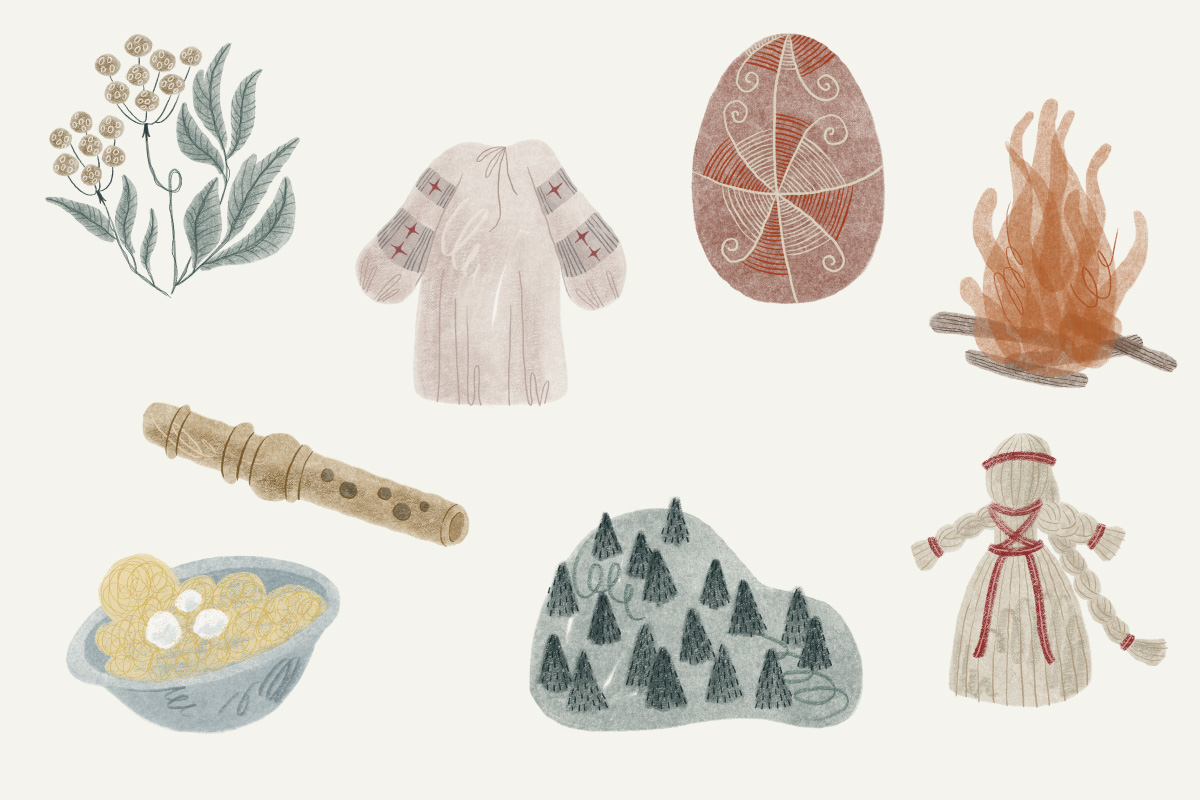
The aim of my project from the outset was to provide reliable, useful, and interesting information about Ukrainian folklore. A key point I made to myself was that the information was intended to be clear and easy to read. Delivering reliable information was a challenge, considering my topic was part of oral history, so I believe there is no such thing as absolute reliability. Nonetheless, I still believe that this information can be quite useful, as Ukraine is only now starting to rediscover its own culture. Traditional celebrations are gaining popularity each year. Each time we learn more about how things were made by our ancestors, whose practices often have deep roots from hundreds of years ago, when paganism was still the main religion, when people believed strongly in supernatural powers and were willing to do anything to keep them calm and avoid misfortune. People are becoming increasingly interested in the origins of various traditions, and folklore, for sure, can provide valuable insights into the lives of those from bygone times.
Visual Identity
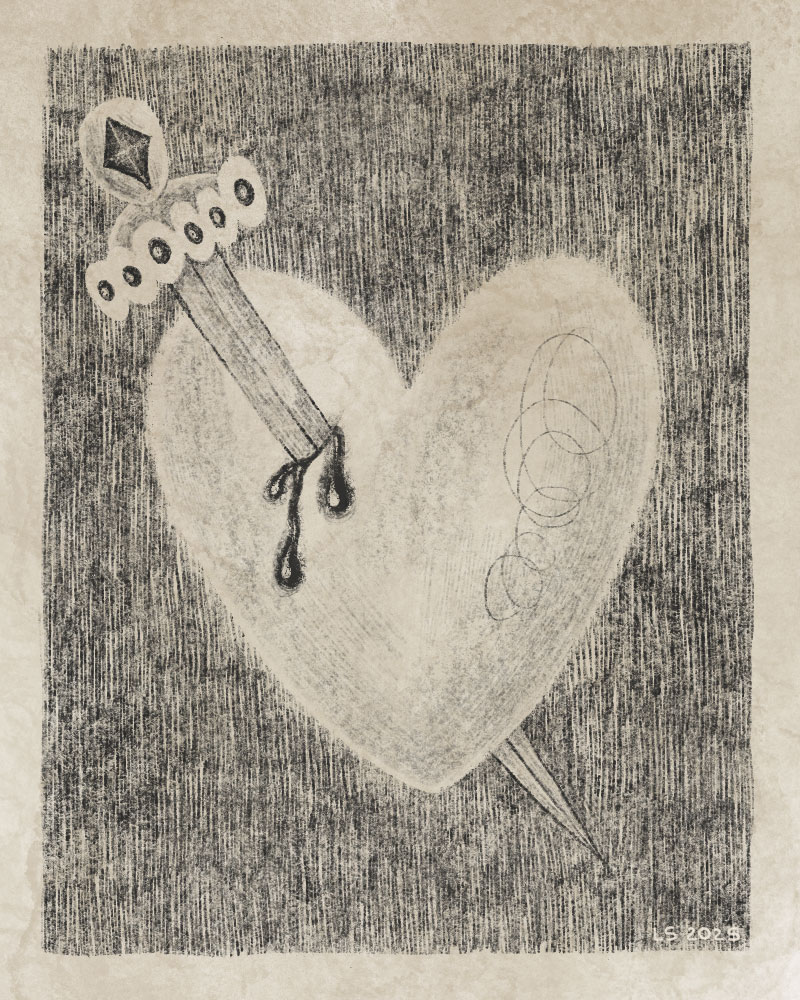
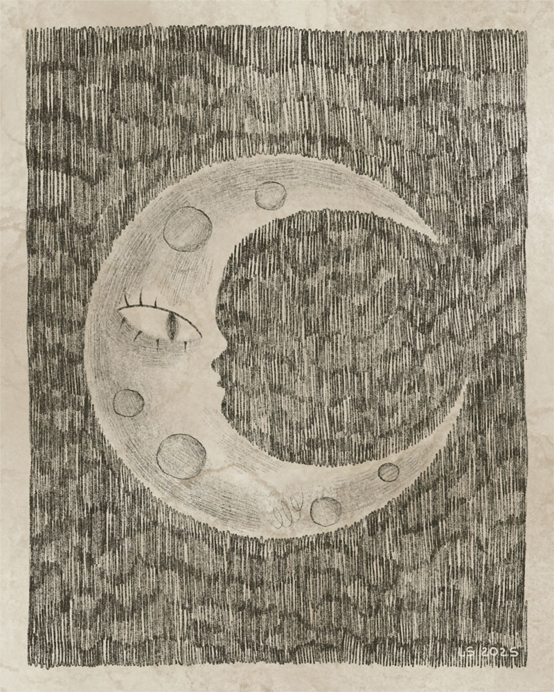
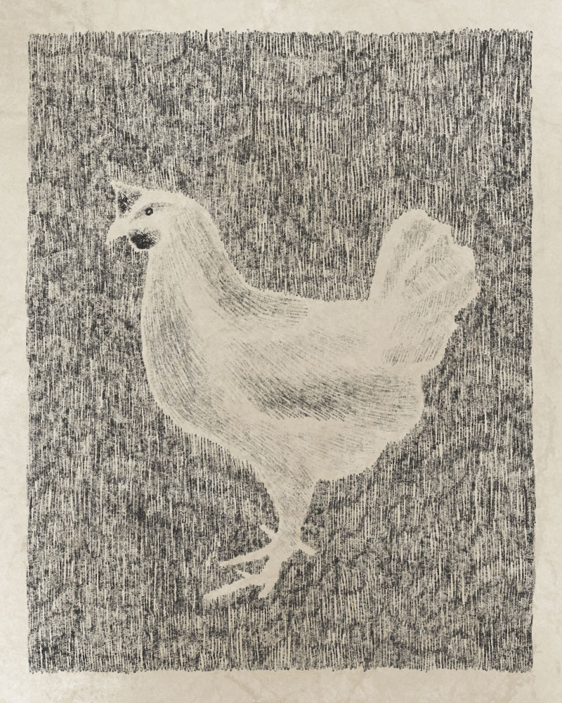
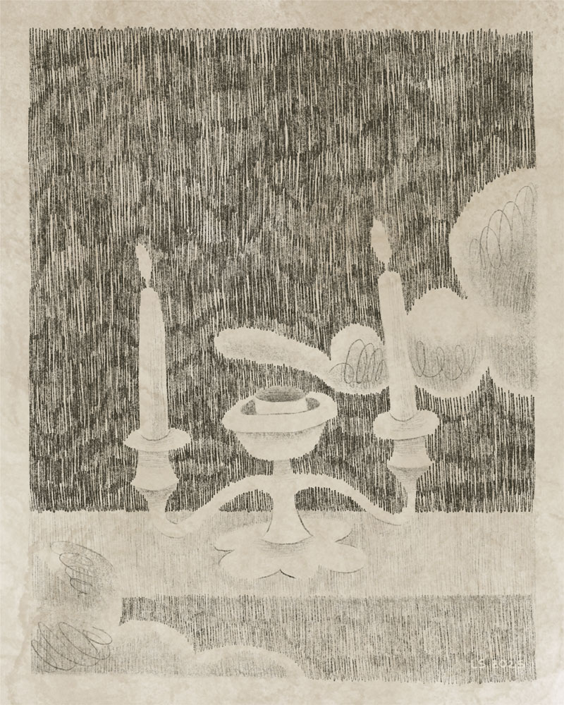
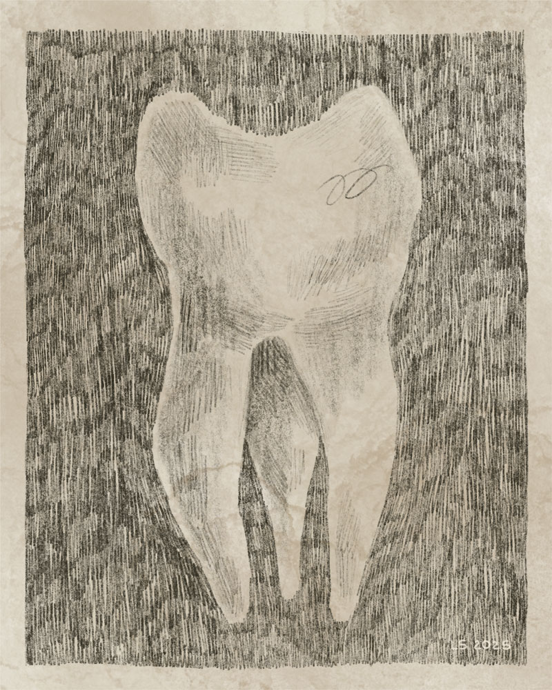
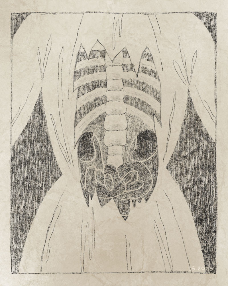
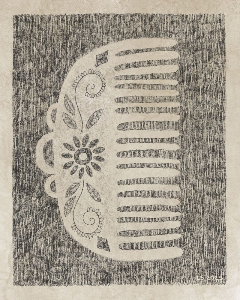
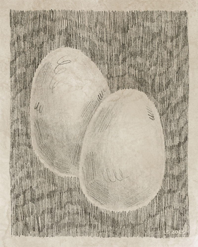
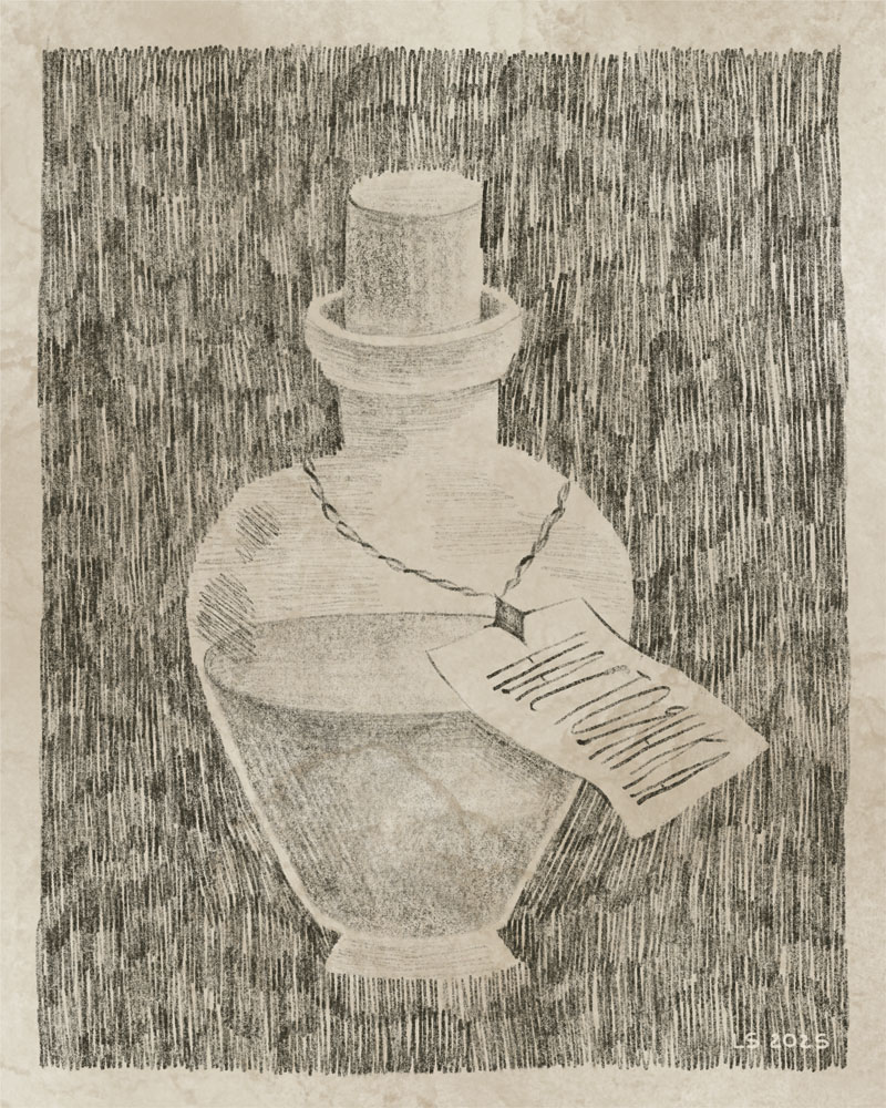
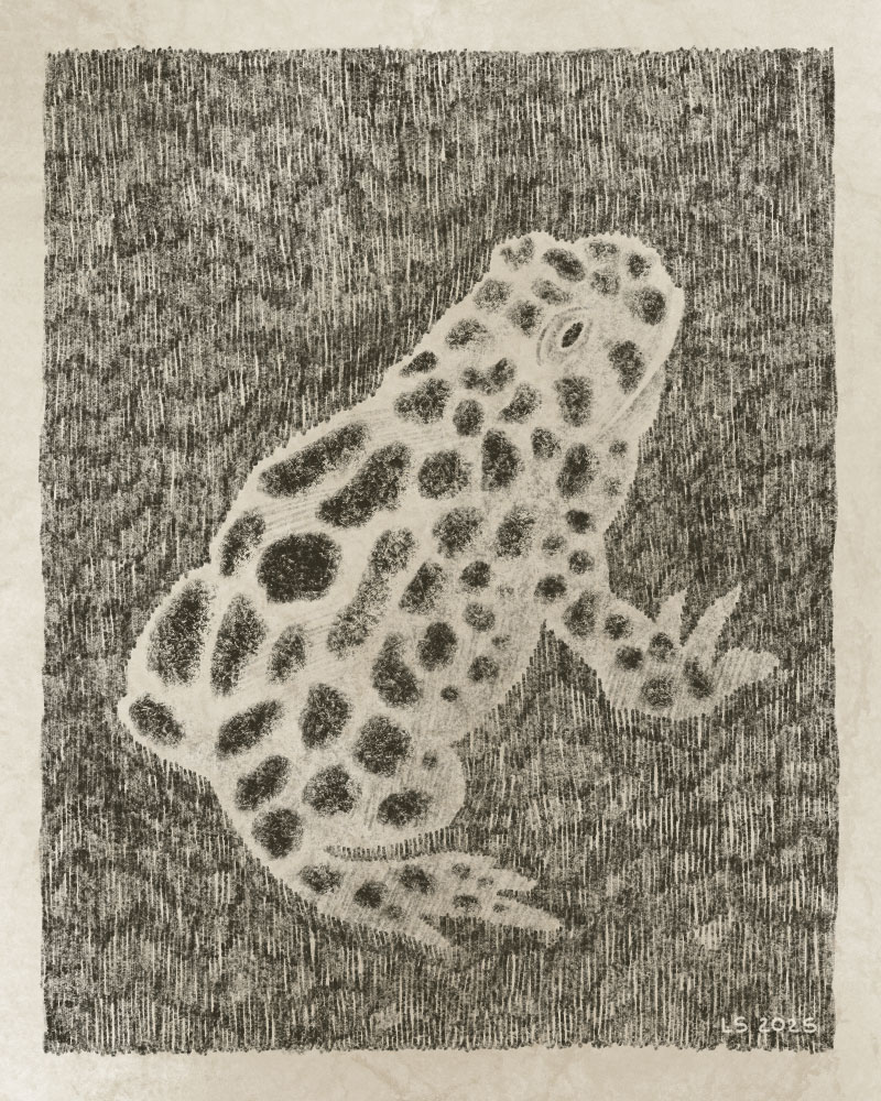
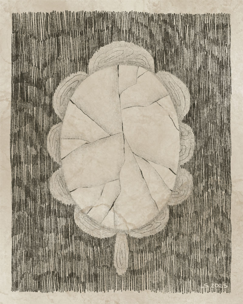
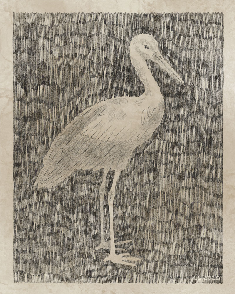
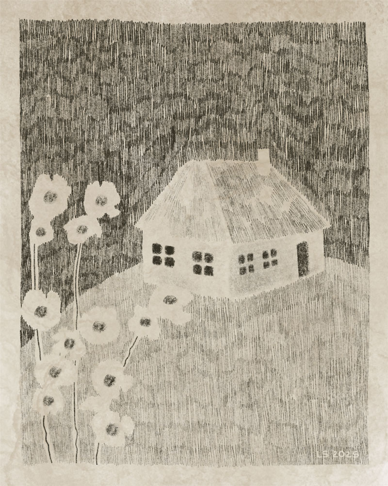
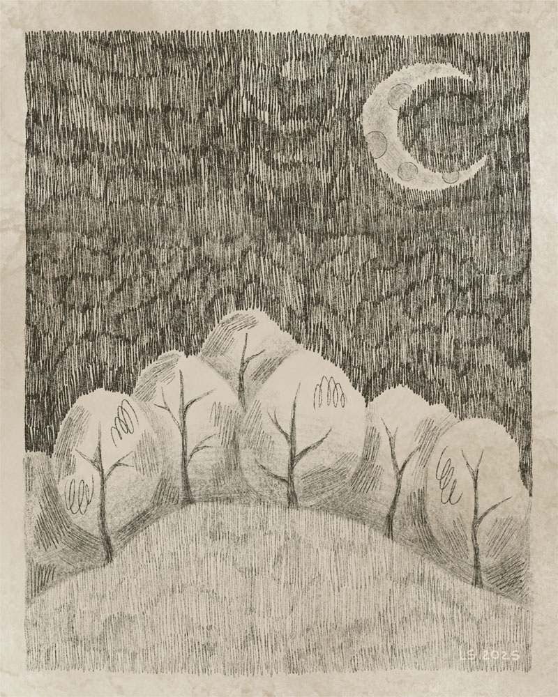
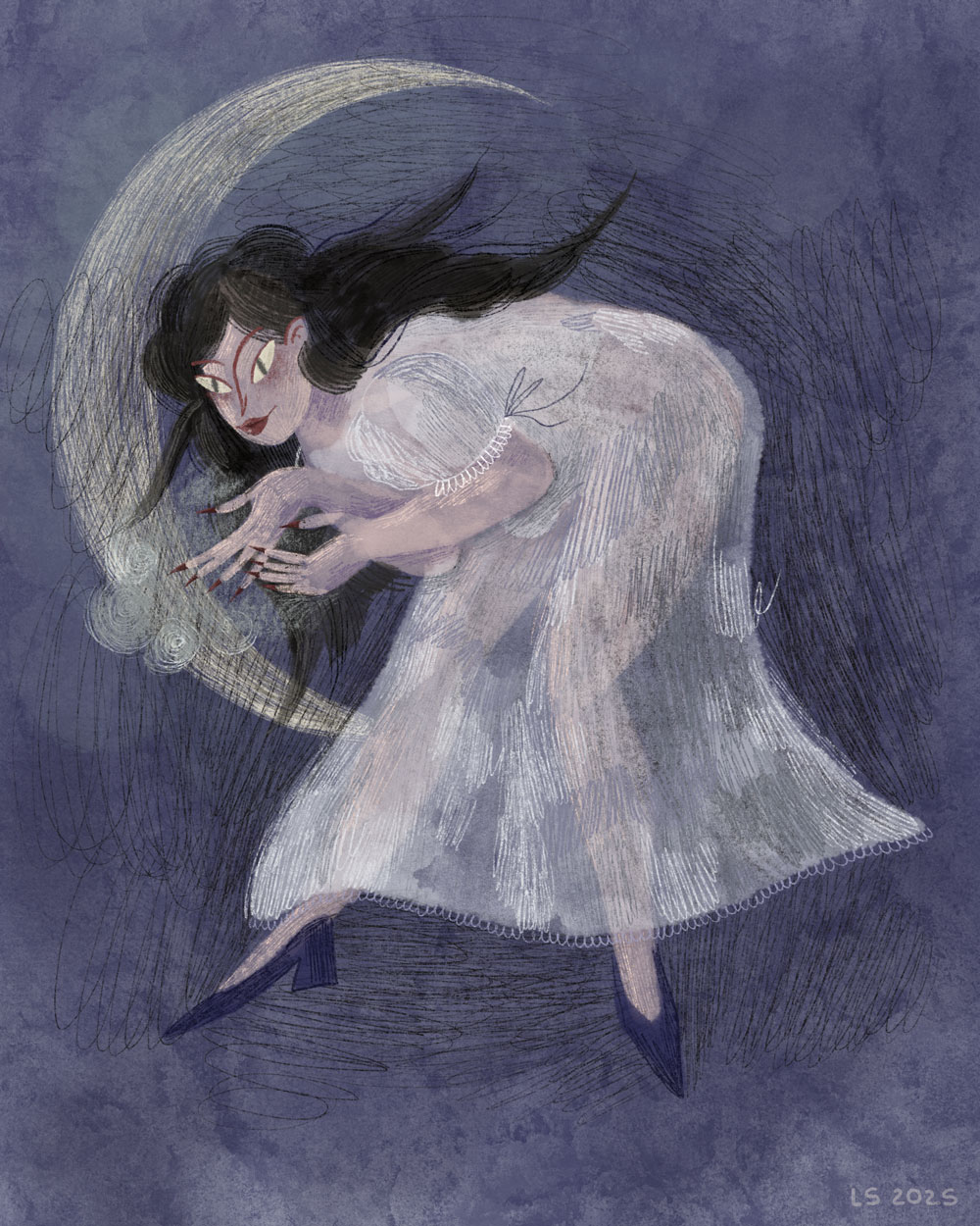
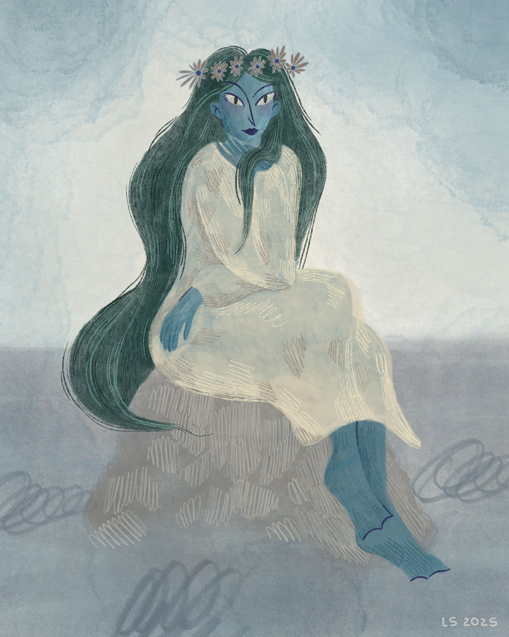
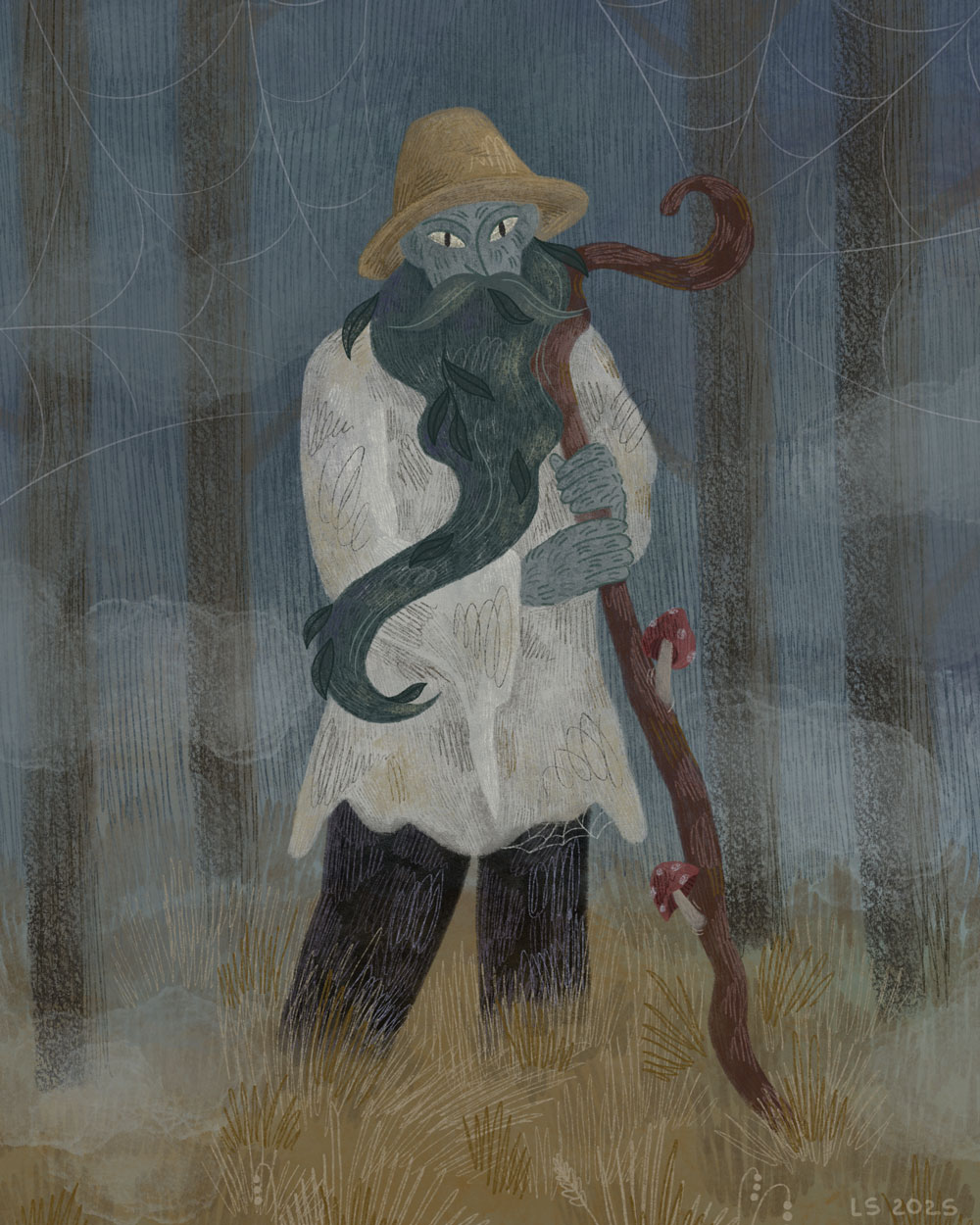
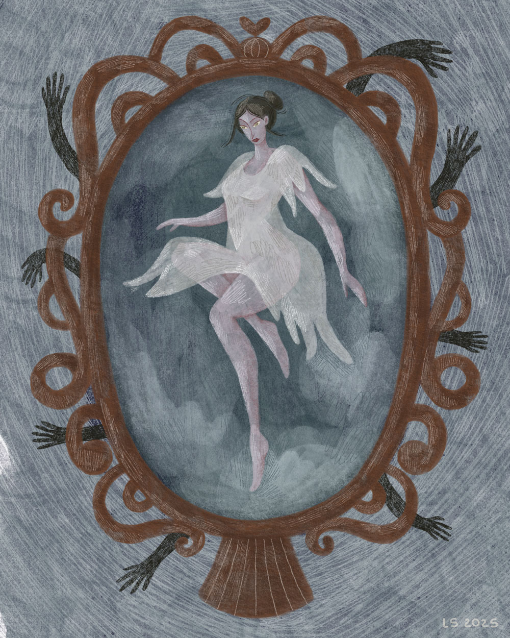
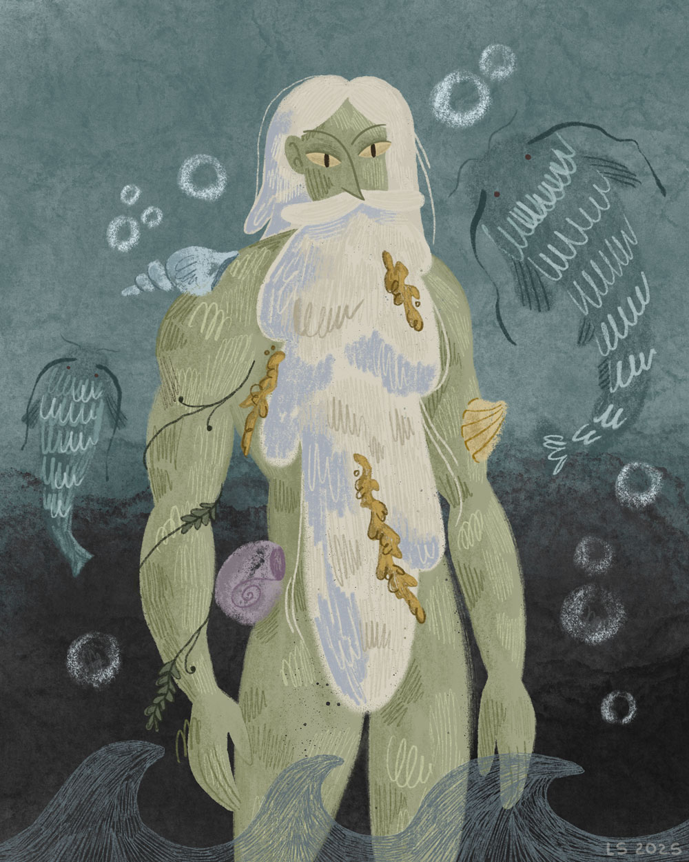
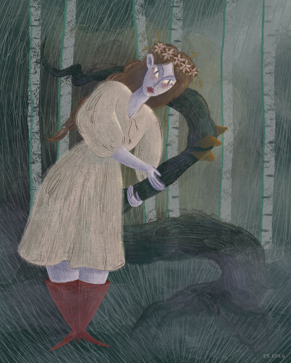
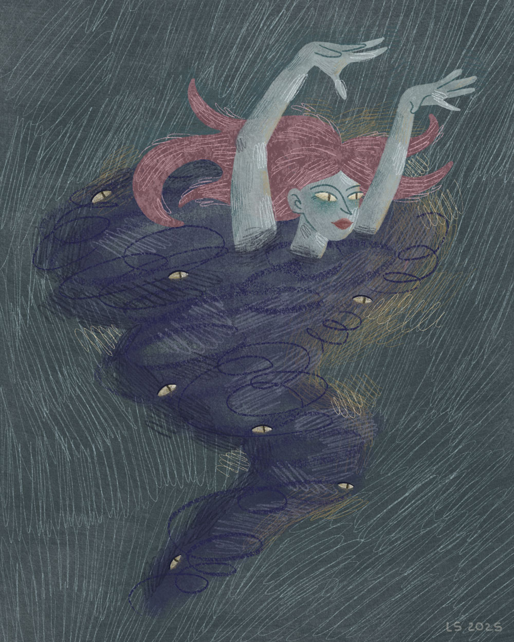
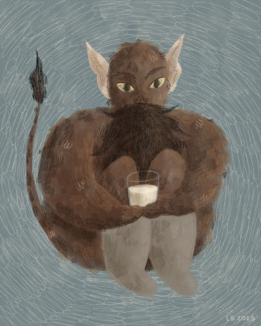
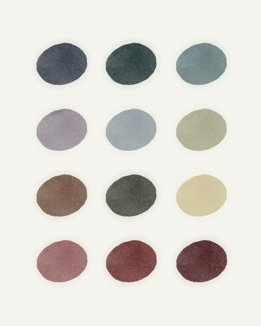
I wanted readers not just to skim through the text, but to have an authentic experience while reading it. When I began creating the first few colourful main illustrations, I realised how much they shaped the overall tone of the project. I still wanted to maintain a bookish, paper-like feel throughout the design, reflected in the fonts for body and headings, as well as the header and footer. To support this visual style, I integrated monochromatic, sketch-like illustrations. These retain the hand-drawn, bookish feel and, in my opinion, complement the main illustrations because both use what could be described as ‘natural materials’. Of course, the illustrations are digitally drawn, using brushes that imitate watercolour, gouache, pastel, oil pastel and different types of pencil. All were created using layering and texture, just as they would be on real paper with natural tools.
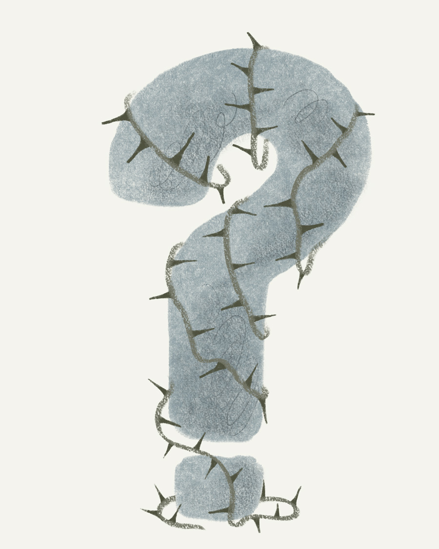
404 Page
For the 404 page, I initially created a sketch illustration of a question mark and intended to incorporate the same type of flowing spirits as on the main page. However, I then realised that it would be more consistent if the first illustration was colourful.
Additionally, the home page features animated spirits that move with @keyframes and transform: translateY(px) and rotate(deg). I added these to support the playful interactive feel, also making them ‘run away while hovering’. At the same time, on the 404 page, I decided to keep them static to minimise code. People should not end up on the 404 page frequently, at least that is my goal, not to lead them there. But if they do, I want the page to be easy to navigate, and to feel secure that they have not left the website due to the custom design. Excess movement could distract from its main purpose, which is unnecessary.
Illustrations
The colours of the illustrations are soft and more natural, which suits the topic of the website, as different creatures can be found in real life, ‘in nature’, not only on the screen of your computer.
All images have short but descriptive alt texts. The only ones with an empty alt attribute are the decorative images at the top of the categories page, as they do not contain any relevant information for the context; screen reader users can simply skip them without spending extra time on them.
Architecture And Layouts
My approach was mobile-first, and then, at breakpoints, the layout changes. I did not set specific screen sizes for mobile, tablet or desktop because I wanted to adjust the layout not to the device but to the content itself.
Initially, I designed a header at the top of the page, with my logo centred at the top, and my links and search field at the bottom, all with a set maximum width. Moving the header to the left side allowed my website to stand out from others, and users have easy access to navigation without taking up extra vertical space. Considering that websites usually have white space on the sides of the text to ensure a proper reading line length, this approach is beneficial.
My header moves to the left side at the breakpoint of 1300px, so initially there is not enough space to make the layout interesting. However, at the breakpoint of 1400px, I visually have enough space to play with the blocks. From that point, I started creating a layout with the following rules:
.post-main-grid and .text-right-float have a margin-left of 14rem.post-left-grid and .text-left-float have a margin-right of 14rem.skinny-text has both margin-left and margin-right of 14rem.pic-right-float for floating illustrations on the right.pic-left-float for floating illustrations on the left
I also added a 7rem gap between blocks to ensure the page is not overloaded and retains some clean, free space.
Glossary
I created archive-glossary.php, a template for the Glossary Archive. I made an alphabetical list and used dropdown links to posts to display the definitions of my words. I kept illustrations in the list at all times, which my PHP extracts as the first image in my posts. $matches[0] contains the complete original <img> tag from my WordPress content, including the alt attribute. For the dropdown, I removed the picture from the post so it won't be displayed twice. I divided different letter groups using a custom SVG line that repeats the one in my header and footer by applying the .glossary-letter::after pseudo-element, creating empty content, and setting the SVG as the background-image.