JUJU wanted a consistent brand identity across all projects, while also needing posters for different pop-ups, new dishes or specialties, and social media content for their Instagram page (illustrated posts and stories), as well as some animations for a marketing campaign.
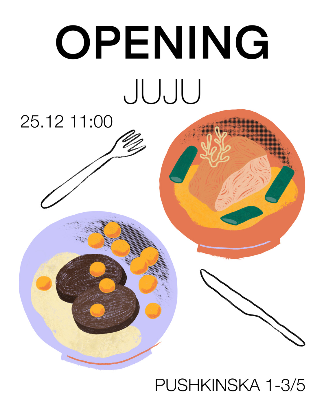
After trying a few different styles, we decided on a more natural illustration approach, using brushes that imitate traditional tools such as pencils and pastels, and incorporating a wider variety of textures for an eye-catching look. We combined this with modern but light typesetting to create a brand image that feels high-end, yet still conveys a sense of organic and homemade produce.
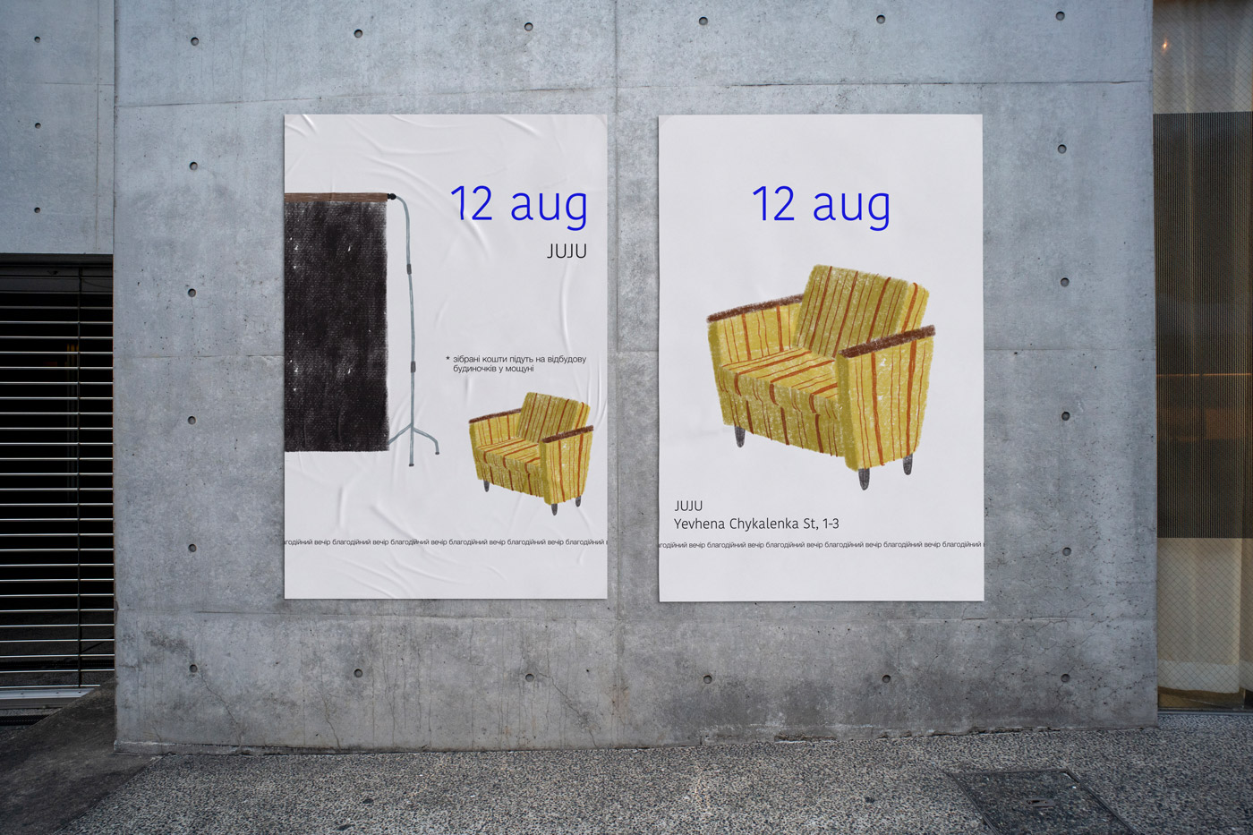
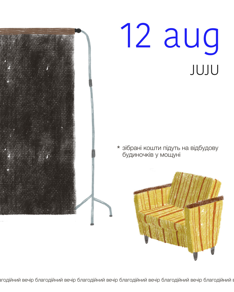
Charity Event
The task was to create posters for a charity event that raises money to help Ukrainians who lost their homes due to the Russian invasion rebuild their houses. During these difficult times, cafés often use their customer base to raise funds for various war-related causes. Therefore, the goal was to design non-triggering posters that align with the café’s brand identity, incorporating elements of its décor and reflecting the aim of the event — to organise a charitable photoshoot.
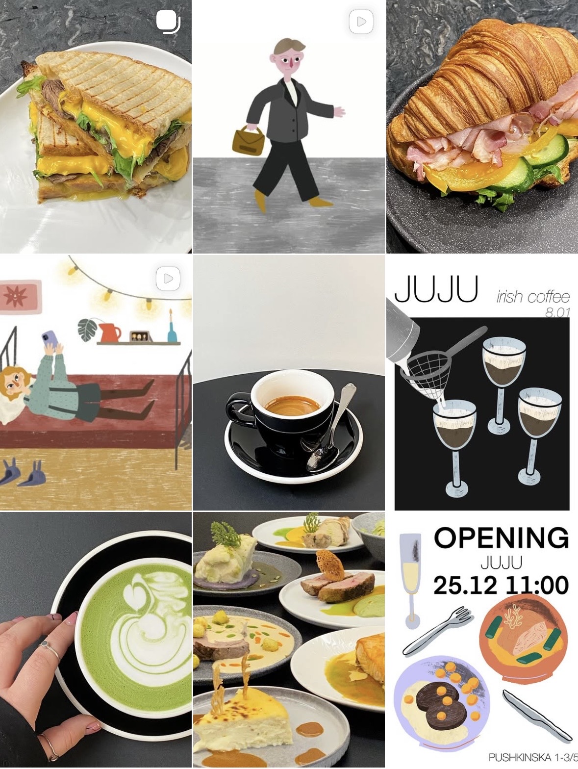
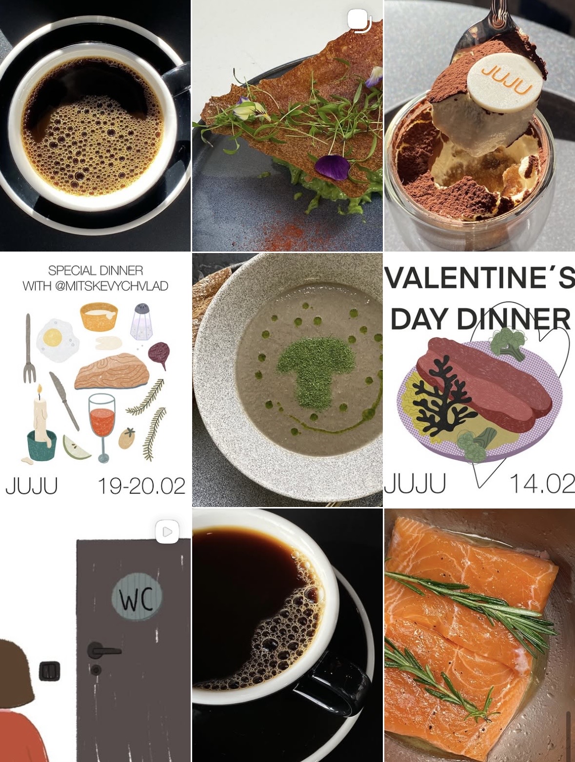
Content Creation for Instagram
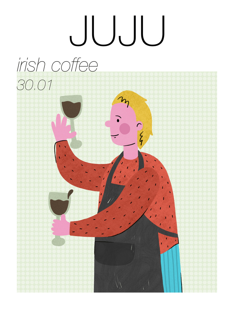
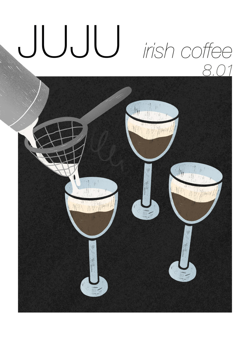
For this project, I created a series of social media content and posters for JUJU, with the aim of making the brand feel fun, lively, and instantly eye-catching.
The content highlights key menu items, from toasted sandwiches and pastries to speciality coffee, using close-up compositions and rich colours to make the food feel inviting and indulgent. Alongside this, simple character illustrations and lifestyle scenes introduce a sense of movement and storytelling, helping the brand feel approachable and modern.
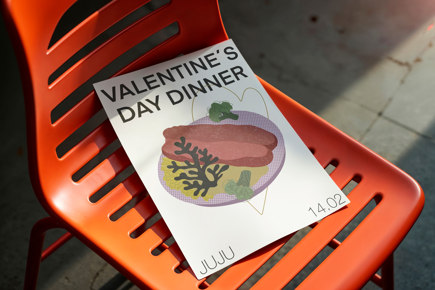
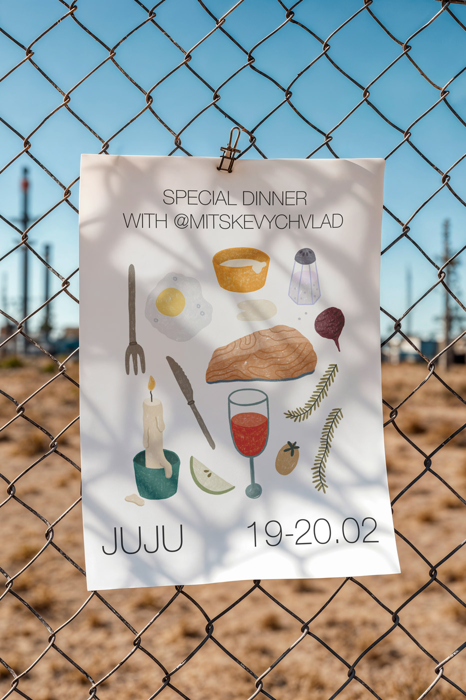
Pop-Ups
Animations Campaign
JUJU needed a comprehensive social media campaign to launch their business. We decided to create a set of three animations, all connected by the same theme: reasons to go to JUJU. It’s not only a place for young people to enjoy a good coffee and work on their computers, but also a great lunch spot for busy office days, as well as an ideal place to catch up on the latest news with friends, while having some drinks and dinner. The animation style is consistent with the illustration style used for their social media and posters.
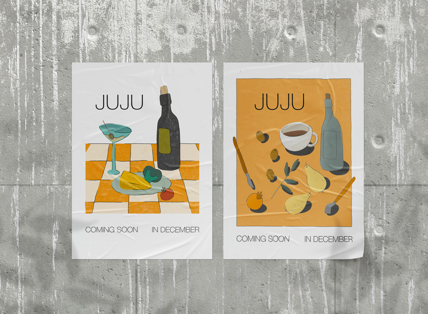
How It Started
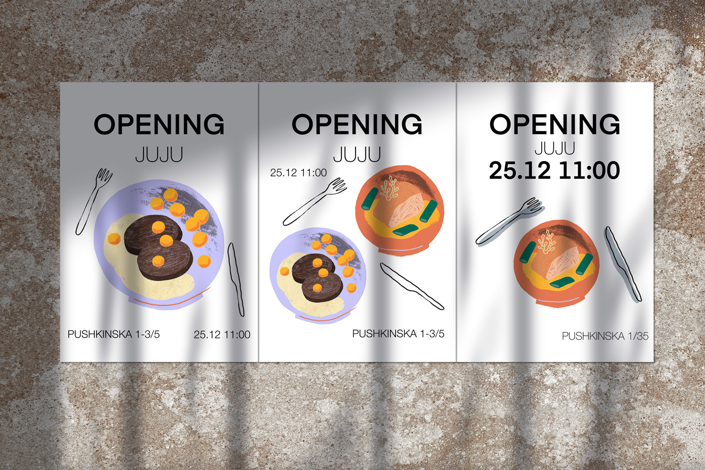
Before settling on the illustration style and main visual identity, we explored a few approaches for the “coming soon” posters. We had a few attempts and failures before deciding on the final overall look. Those versions looked too “digital” and didn’t align with the general brand vibe.